Recently I'm finding myself often putting together user interface mockups to solidify my thinking around what product should do. Then I began to question myself while I was flipping through hefty mockups that I created last few days. Am I spending my time wisely? How much does user interface (UI) design really count for? Shouldn't form be secondary to function at least in social network UI design?
Then I soon realized how foolish this question was. Of course, it matters. User interface matters a lot because that's what user sees.
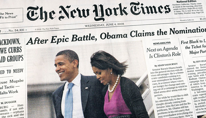
Look at perfectly functional two alarm clock radios below.
 |
GE Model C434C Tube
Alarm Clock AM Radio |
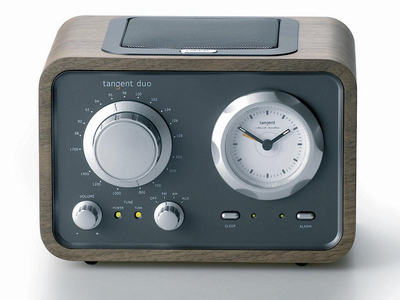 |
| Tangent DUO Clock Radio
|
Which one would you buy? GE alarm clock or Tangent DUO clock? I'm sure you have a preference between the two. Both of them provide identical function -- well almost, Tangent DUO probably has FM, while GE does not, but let's suppose they are functionally identical. GE is a true antique with pronounced clock face, while Tangent DUO is a modern interpretation of old boxy radio design. Is there a right answer? Of course not. What you picked makes perfect sense, FOR YOU.
That's my point. User interface should be designed with 'user' in mind. If the interface appeals to intended users, then the interface is working. It's doing its job of attracting users to spend more time with the product.
Just like alarm clock radio, there are
close to a thousand social networking sites today. Each social networking site is competing for target user's attention. One way to differentiate from the rest is user interface design. User interface design has to have aesthetical appeal to target user so that they enjoy interacting with the medium.
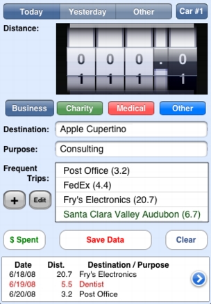
That doesn't mean there is no guideline for better UI design. Take a look at below two iPhone application UIs of TripLog/1040. Which one is more appealing to you?
 |
| Old TripLog/1040 UI |
 |
| New TripLog/1040 UI |
It is no doubt the second one, new TripLog/1040 UI. If you look closer to the first one, you'll discover there is no alignment of names and parameters. "$ Spent" button is not aligned with rest of buttons, raising question in user's mind that it may have different context than "Save Data" and "Clear" button. "Type:" and its buttons are listed vertically while the rest of buttons are laid out horizontally. There are at least three other misalignments in the first UI that leaves jarring feeling in user's mind.
There is one more thing: color. The reason why second looks more appealing than the first UI is the second UI's background color of light blue. Cyan, even if it's light, draws attention from user, and background is not the place where user should focus on.
That's just for aesthetics. Then there is
functional design of UI, and it deserves whole new blog entry to go through.
People tend not to appreciate the value of good-looking UI. Because the best UI is the one that makes itself invisible to the user. Bad ones make themselves noticeable. Worst are the ones that make the user look dumb. Here's what I mean:
 |
| Wow, Where Do I Begin? |