I am no designer by training but I heard of phrase "form follows function." Everything around us is designed by someone with a goal of making it easier to use, making it more appealing to users. Nowhere this form and function interplay is more evident than font design.
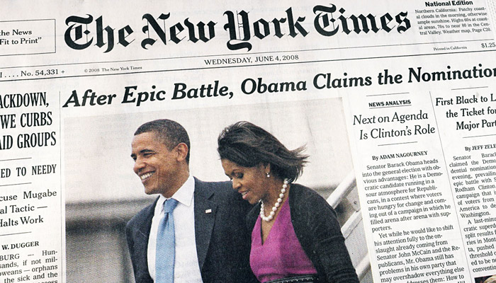
Font gives a site an identity. Take a look at the New York Times newspaper front page:
There are multiple fonts clearly marking headline title, article titles, sections, dates, labels and article text. Fonts are used as voices to differentiate what is written. Not only that, they give the newspaper unique identity and they all add up to make the newspaper the New York Times.
But fonts does much more than to give identity. It has to function well. Researchers at MIT AgeLab released their finding that Humanist design font are easier to read than Square Grotesque design font for male drivers.
So the question is how to balance this form and function. There is no short answer. It depends on whom the product is targeted to and how targeted customers are expected to use the product. In case of GPS navigation system, it makes sense to make fonts easier to read, hence more function. If it is a movie poster, maybe form is more important.
But whatever you do, be aware of your choice must have a mixture of form and function.
Font gives a site an identity. Take a look at the New York Times newspaper front page:
 |
| Source: http://idsgn.org/posts/know-your-type-cheltenham/ |
There are multiple fonts clearly marking headline title, article titles, sections, dates, labels and article text. Fonts are used as voices to differentiate what is written. Not only that, they give the newspaper unique identity and they all add up to make the newspaper the New York Times.
But fonts does much more than to give identity. It has to function well. Researchers at MIT AgeLab released their finding that Humanist design font are easier to read than Square Grotesque design font for male drivers.
 |
| Source: http://www.popsci.com/science/article/2012-09/how-better-fonts-could-reduce-car-crashes |
So the question is how to balance this form and function. There is no short answer. It depends on whom the product is targeted to and how targeted customers are expected to use the product. In case of GPS navigation system, it makes sense to make fonts easier to read, hence more function. If it is a movie poster, maybe form is more important.
But whatever you do, be aware of your choice must have a mixture of form and function.
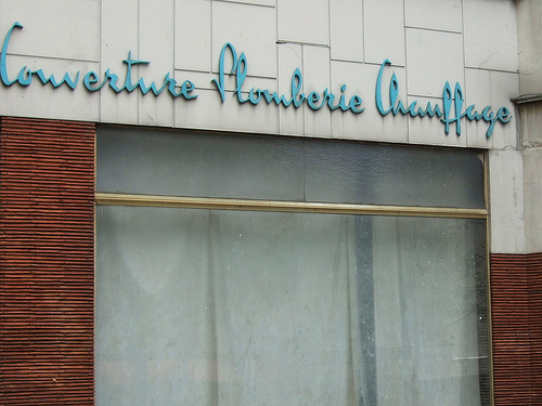 |
| I am guessing it's a french store, but don't ask me to look it up. Source: http://www.uxbooth.com/blog/11-quick-tips-for-more-usable-content/ |
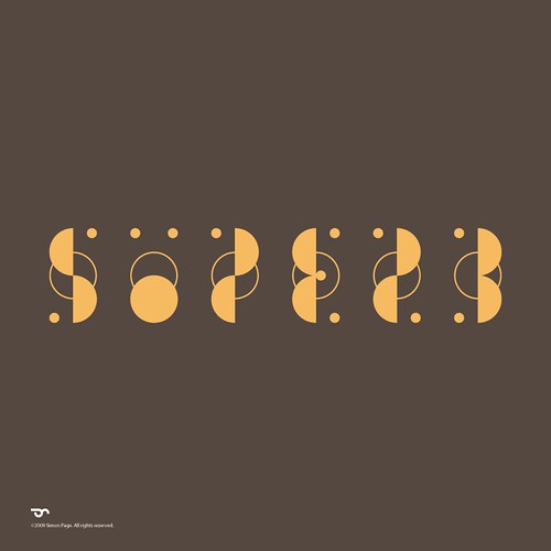 |
| This one looks more like a puzzle than font. What does it say? Hint: there is no number involved. Answer is available from the source. Source: http://www.flickr.com/photos/simoncpage/4084318845/ |
No comments:
Post a Comment