Recently I enjoyed reading Steve Krug's Don't Make Me Think, The Second Edition. For those of you who are Web design practitioners, I strongly recommend that you pick up a copy and go through it.
After reading through it, one of the lessons that stuck with me was the benefits of leveraging established user interface design: Fancy word for recycling what's known to work.
In some sense this flies in the face of innovation. Innovation is good, as long as it is done in a way that minimizes the user's mental exercise to learn and get accustomed to it. If the learning curve is too steep, or even worse the interface is not guiding users where to begin, it will fail. In other words, the center of innovation should be human, the users.
Let me demonstrate with two websites:
Even though the first Korean website is mostly written in Korean, most visitors will have no problem with navigating the site. That's because it follows convention established by well-known sites like Ethan Allen.
This seems rather obvious. After all, many of us have been talking about human-centered design for over decades. Surely everyone must understand this point... Well, almost.
Although this lesson seems too self-evident, people often make design decisions that run counter to human-centered design because of two reasons:
1. Technology is too cool to resist
Just because you have a digital camera, it doesn't make you a director. To make a good movie, you need to tell a good story to people. To do so, you'll first need a great script.
Same thing with technology. Just because technology allows you to do cool things, it doesn't make sense for you to use it unless it fits in the whole user experience and what you are trying to convey to the users.
Check out this example.
Well, I don't know about you, but I couldn't figure out how to navigate the site, let alone what the site was about after playing around with it for 30 seconds (that was how long I could endure the black-and-white brain image...).
I would conjecture that the site designer took the inspiration from tilt picture viewer which was actually lot more pleasant to look and navigate. Just because technology is cool on its own right doesn't make it cool to use it for all contexts.
2. I know what user wants because I'm the user (aka I am my own usability tester)
Novice designers, especially engineers moonlighting as designers, often make mistakes of thinking that they understand the users best. Sometimes this can be true. Especially many Web2.0 sites that are targeting consumers, yes we can say that most of us are consumers of one kind or another.
But while designing the site and interface, making design detail decisions, picking out the right color scheme and fresh layout, designers inevitably get tainted by their own knowledge of how their site is designed.
In order to get most user's perspective, it is vital to conduct usability testings with new users who were not tainted with prior knowledge. Why? Because most users will have no idea of what the site was about when they first visit. And it is critical to take advantage of their first 30 seconds on the site to explain what it does, why they want to stay, and what the next step is.
Well, there you have it. One of the lessons that I was able to internalize from Steve Krug's book.
What do you think about the lesson? If you have read the book or any other UI/UX design book, what would you recommend?
After reading through it, one of the lessons that stuck with me was the benefits of leveraging established user interface design: Fancy word for recycling what's known to work.
In some sense this flies in the face of innovation. Innovation is good, as long as it is done in a way that minimizes the user's mental exercise to learn and get accustomed to it. If the learning curve is too steep, or even worse the interface is not guiding users where to begin, it will fail. In other words, the center of innovation should be human, the users.
Let me demonstrate with two websites:
 |
| Korean website selling furnitures; even if you don't know Korean, you can instantly identify search, utility menus, navigation bar on top, and furniture categories to the left. |
 |
| And the reason why Korean furniture site looks so familiar; because it follows well-known design pattern, just like Ethan Allen. |
Even though the first Korean website is mostly written in Korean, most visitors will have no problem with navigating the site. That's because it follows convention established by well-known sites like Ethan Allen.
This seems rather obvious. After all, many of us have been talking about human-centered design for over decades. Surely everyone must understand this point... Well, almost.
Although this lesson seems too self-evident, people often make design decisions that run counter to human-centered design because of two reasons:
1. Technology is too cool to resist
Just because you have a digital camera, it doesn't make you a director. To make a good movie, you need to tell a good story to people. To do so, you'll first need a great script.
Same thing with technology. Just because technology allows you to do cool things, it doesn't make sense for you to use it unless it fits in the whole user experience and what you are trying to convey to the users.
Check out this example.
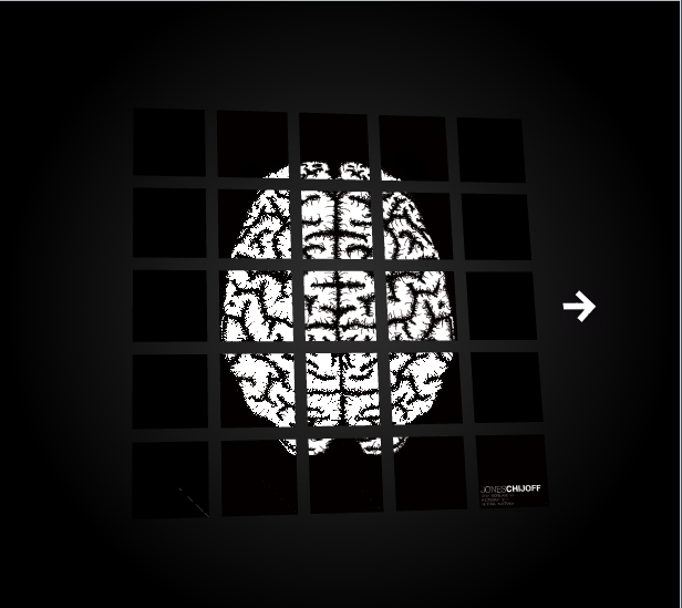 |
| As of 5/15, site is still alive. What's it about? Well... I'll let you figure it out on your own. If you want more challenges, you can get more here. |
Well, I don't know about you, but I couldn't figure out how to navigate the site, let alone what the site was about after playing around with it for 30 seconds (that was how long I could endure the black-and-white brain image...).
I would conjecture that the site designer took the inspiration from tilt picture viewer which was actually lot more pleasant to look and navigate. Just because technology is cool on its own right doesn't make it cool to use it for all contexts.
2. I know what user wants because I'm the user (aka I am my own usability tester)
Novice designers, especially engineers moonlighting as designers, often make mistakes of thinking that they understand the users best. Sometimes this can be true. Especially many Web2.0 sites that are targeting consumers, yes we can say that most of us are consumers of one kind or another.
But while designing the site and interface, making design detail decisions, picking out the right color scheme and fresh layout, designers inevitably get tainted by their own knowledge of how their site is designed.
In order to get most user's perspective, it is vital to conduct usability testings with new users who were not tainted with prior knowledge. Why? Because most users will have no idea of what the site was about when they first visit. And it is critical to take advantage of their first 30 seconds on the site to explain what it does, why they want to stay, and what the next step is.
Well, there you have it. One of the lessons that I was able to internalize from Steve Krug's book.
What do you think about the lesson? If you have read the book or any other UI/UX design book, what would you recommend?
I am inspired by your live journal. Thanks for sharing.
ReplyDeleteDrama Online